A shift is underway in home interiors. Warm, inviting shades are replacing the crisp, cool colors of the past. This trend, marked by Universal Khaki (SW 6150) as the 2026 Sherwin-Williams Color of the Year, signals a move toward comfort and timeless elegance. For homeowners in Southern Indiana and beyond, embracing warm neutrals means creating spaces that are both stylish and welcoming.
In this guide, we’ll break down the warm neutral trend, highlight standout Sherwin-Williams shades—including options from Reinbrecht Homes’ curated palette—and explain why Accessible Beige (SW 7036) is one of the most versatile whole-home colors for today’s open floor plans.
Universal Khaki and the 2026 Color Trends You’ll Love
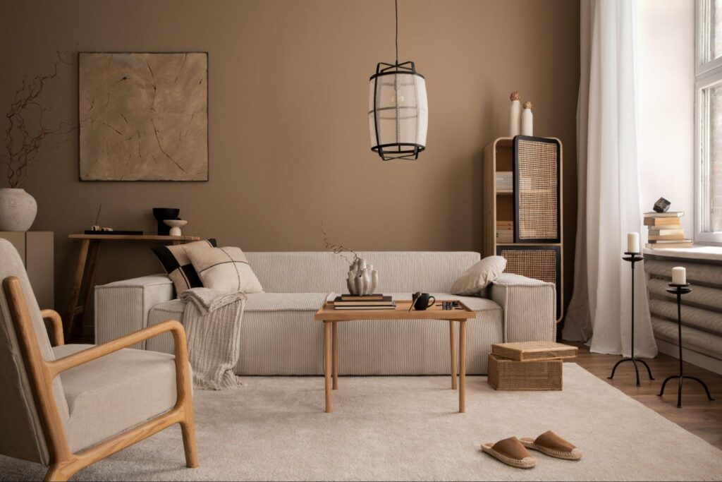
When Sherwin-Williams named Universal Khaki (SW 6150) the Color of the Year for 2026, they set a tone that marries modernity with timeless appeal. This mid-tone neutral—characterized by subtle yellow-green undertones—creates a cozy atmosphere without overwhelming a space. Universal Khaki is not just a trend; it embodies a broader movement toward layered, inviting interiors that feel less sterile than the all-white or cool gray schemes of yesteryear.
This color speaks to a design philosophy that values essentialism. Homeowners are looking for spaces that offer both personal comfort and enduring style. In regions like Southern Indiana, where long, gray winters prevail, warm hues bring light and depth, transforming a home into a sanctuary during colder months.
How Reinbrecht Homes’ Palette Aligns with 2026 Trends
Reinbrecht Homes has long anticipated evolving design trends by curating a palette of warm neutrals that are both practical and stylish. Their collection of Sherwin-Williams colors supports a design philosophy centered on comfort and versatility. This palette not only reflects current trends but also ensures that a home remains timeless.
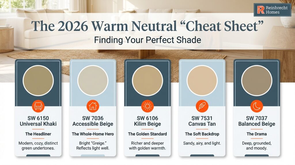
Reinbrecht’s selection includes shades that offer flexibility for different spaces:
- Accessible Beige (SW 7036): A warm “greige” ideal for whole-home use. It balances brightness and warmth, complementing wood tones and white trim.
- Kilim Beige (SW 6106): A richer beige with subtle golden undertones, perfect for areas that benefit from a distinctly warm atmosphere.
- Balanced Beige (SW 7037): A deeper, more dramatic neutral suited for cozy spaces like dining rooms or bedrooms.
- Canvas Tan (SW 7531): A soft, sandy option that works well in open floor plans and bright, airy spaces.
These colors share a common trait: they enhance interior spaces without overwhelming them. Reinbrecht Homes’ palette is designed to work well with a variety of finishes and furnishings, providing homeowners with the flexibility to create a look that is both modern and enduring.
Accessible Beige: The Versatile Hero for 2026
While Universal Khaki boldly leads the trend as the 2026 Color of the Year, it might not suit every space in your new home. Accessible Beige offers a practical alternative that captures the same warm, inviting essence but with greater versatility.
Lighter, Brighter, and Perfectly Balanced
Accessible Beige is distinguished by its higher Light Reflectance Value (LRV), which means it reflects more light in a room. This brightness makes it an excellent choice for spaces with limited natural light or smaller rooms that could feel cramped by darker hues. It provides the warmth needed to create a cozy environment while ensuring that interiors feel open and inviting.
A Close Cousin to Universal Khaki
Both Accessible Beige and Universal Khaki share warm-neutral fibers and subtle green undertones. However, Accessible Beige is a softer and brighter version that retains the characteristic warmth without overpowering the space. This quality makes it an ideal choice for homeowners seeking a current yet adaptable backdrop.
Accessible Beige vs. Agreeable Gray
A common debate in modern interiors is Accessible Beige versus Agreeable Gray. While Agreeable Gray leans toward a cooler palette, Accessible Beige offers unmistakable warmth. Its gentle, earthy tone is better aligned with 2026’s emphasis on inviting, lived-in spaces. For those who desire an atmosphere imbued with subtle coziness, Accessible Beige is the clear choice.
Trends That Are Out in 2026
As warm neutrals rise in popularity, certain trends are being left behind. Here’s a quick look at what’s fading:
Moving Away from All-White Interiors
The minimalist, all-white interior once celebrated for its clean lines now feels sterile and impersonal. While white remains a strong accent color, relying solely on white can strip a home of character and warmth. Mixing warm neutrals with white accents creates layers that are both modern and inviting.
Shifting from Modern Farmhouse Design
The high-contrast, black-and-white look of modern farmhouse design is being softened. Today’s homeowners prefer a version of farmhouse style that uses warm wood tones, muted neutrals, and natural textures. This approach adds depth and makes a home feel more comfortable without sacrificing style.
Leaving Cool Grays Behind
Cool grays have dominated for years, but they often lack the inviting quality that warm neutrals provide. Greige tones, such as Accessible Beige, merge the sophistication of gray with the comfort of beige, resulting in a color that better suits today’s relaxed yet refined interiors.
Tips for Selecting the Perfect Warm Neutral Paint Color
When choosing a warm neutral, consider a few key factors to ensure a harmonious result:
Coordinate with Flooring and Lighting
Your paint should complement your flooring and respond well to your room’s lighting. Dark floors often work well with Accessible Beige, which enhances the warmth without creating a heavy feel. Similarly, rooms with limited light benefit from the brightness of accessible neutral shades.
Test in Real Conditions
Always test paint samples on your walls before making a final decision. Observing how the color interacts with your natural light throughout the day can prevent surprises and ensure the chosen hue suits your space.
Plan for Whole-Home Harmony
For open floor plans, using a single versatile color like Accessible Beige can create a seamless flow between rooms. This unified approach enhances both the visual appeal and the perceived space in your home.
Creating a Cohesive Home Environment with Warm Neutrals
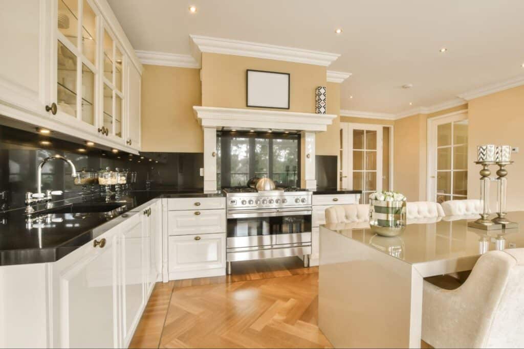
In addition to selecting the right paint, consider how warm neutrals can be used to enhance various areas of your home. In living areas, warm shades can help define comfortable seating spaces and create subtle focal points when paired with textured fabrics and natural wood accents. Kitchens benefit from layered lighting combined with warm walls that soften modern appliances and add a welcoming feel during both day and night.
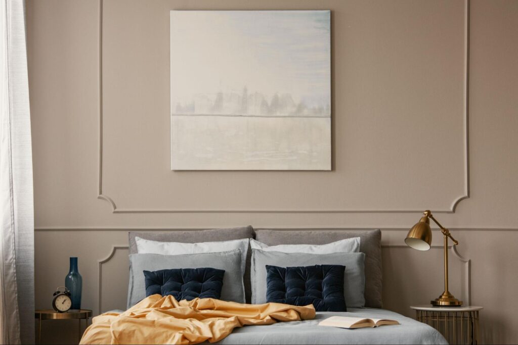
Bedrooms, on the other hand, are ideal for integrating warm neutrals to promote relaxation and restful sleep. A combination of accessible shades and soft lighting is essential in molds such as accent walls or headboard backdrops. Bathrooms also see an uplift when warm colors counter harsh white fixtures, balancing modernity with a soothing ambiance. By thoughtfully incorporating these hues throughout different zones, homeowners can achieve a cohesive, inviting environment that speaks to both style and comfort.
Additional Inspiration: Integrating Warm Accents for a Personalized Touch
Warm neutrals like Accessible Beige (SW 7036) and Universal Khaki (SW 6150) create a flexible backdrop—but the “finished” look comes from the accents layered on top. To keep your home feeling current in 2026, focus on warmth, texture, and repetition.
- Repeat a warm metal finish: Use champagne bronze, brushed brass, or aged bronze across hardware, lighting, and mirrors for a cohesive look.
- Layer in texture (not just color): Add woven throws, linen drapery, bouclé pillows, natural fiber rugs, pottery, and warm wood décor for depth.
- Choose nature-inspired accent colors: Work in olive/sage, clay/terracotta, creamy off-whites, and small touches of charcoal or navy for contrast.
- Warm up each room with simple swaps: Try wood stools in the kitchen, layered ivory/taupe bedding in bedrooms, and sand/stone-toned towels or décor in bathrooms.
- Use warm lighting temperatures: Stick with 2700K–3000K bulbs to help warm neutrals glow—especially during Southern Indiana’s darker winter months.
FAQ: Warm Neutral Paint Colors for 2026
What are the best warm neutral paint colors for 2026?
Warm neutrals with soft, earthy undertones are leading 2026 interiors. Popular choices include Accessible Beige (SW 7036) for a whole-home greige, Universal Khaki (SW 6150) for a cozier mid-tone neutral, and supporting beiges like Kilim Beige (SW 6106), Balanced Beige (SW 7037), and Canvas Tan (SW 7531) for added depth.
Is Accessible Beige (SW 7036) a good whole-house color?
Yes. Accessible Beige is one of the most versatile warm neutrals because it sits between beige and gray (“greige”), helping it coordinate with a wide range of flooring, cabinets, and countertops. It also keeps open floor plans feeling cohesive without reading too yellow.
Accessible Beige vs. Agreeable Gray: which one is warmer?
Accessible Beige reads warmer and more earthy, while Agreeable Gray typically feels cooler and more gray-forward. If you want a home that feels cozy and inviting—especially in lower natural light—Accessible Beige is usually the better match for the 2026 warm-neutral trend.
Does Universal Khaki (SW 6150) look green on the walls?
It can, depending on lighting and nearby finishes. Universal Khaki has subtle yellow-green undertones, which may appear more noticeable in north-facing rooms, rooms with cooler LED bulbs, or next to very bright white surfaces. Testing a sample in your home’s real lighting is the best way to confirm.
What trim color looks best with warm neutrals like Accessible Beige?
Most homeowners prefer a clean, lighter trim to create contrast. A soft warm white or crisp neutral white typically pairs best with warm neutrals, helping the space look fresh without turning stark. For the most consistent result, match trim to your home’s fixed elements (tile, countertops, cabinetry) and test next to the wall color.
How do I choose the right warm neutral for my lighting and flooring?
Start with two checks: light direction and floor tone. North-facing rooms and cloudy winter light often make colors feel cooler, so a warmer neutral can keep the room balanced. If your floors lean warm (oak, honey, warm brown), warm greiges and beiges usually look seamless; if your floors lean cooler or very gray, choose a warm neutral that won’t clash and always test a large sample at different times of day
Warm Neutrals for Style and Comfort in 2026
Warm neutral paint colors are more than a passing trend—they represent a thoughtful approach to creating homes that feel inviting and timeless. Universal Khaki and Accessible Beige combine style with adaptability, providing a foundation that transforms any room into a cozy retreat.
By shifting from cool grays and all-white schemes to warmer, layered hues, you can achieve an interior that is both modern and enduring. Reinbrecht Homes’ commitment to quality is reflected in their curated palette, which aligns perfectly with 2026’s design ethos.
Ready to see these colors come to life? Schedule a tour of our model homes to experience firsthand how these warm neutrals can transform your space.
